


Part of the fashion trend at San Diego State is wearing the university logo on socks, hats and everything in between. The campus bookstore has several apparel options for every student on campus, but the one thing SDSU apparel has in common is the current university logo. However, the SDSU logo has gone through some changes throughout the years — the most recent in 2013.
The Changing of spears
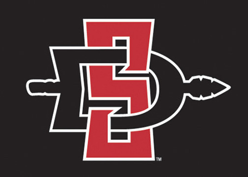
In 2013, Senior Associate Athletic Director John David Wicker and Associate Athletic Director Steve Schnall worked with the university branding committee to unveil the logo that is currently being used. The core symbol within the logo for the last 13 years has been the Aztec spear, symbolizing strength.
Anthropology Department Chair Seth Mallios said the changes to the SDSU logo over the years have seemed to come in waves.
“The logo is stable for a long time, then changes out of no where, with either a rebranding campaign or a change in the president of the university,” Mallios said.
The changes to the previous logo were more of a refresh than a rebrand, as it has had the same general look for over a decade.
“The newest logo was created as part of a rebranding campaign. We felt that we had truly established the San Diego State logo over 10 years, but we wanted to update the looks slightly and make the logo more telegenic,” Schnall said. “With the old logo, television would cut out pieces, so we dropped the ‘state’ from the logo’s center to create a more telegenic logo.”
The SDSU logo is already easily recognized and established within the surrounding community with the success of both the academic and athletic programs. The most recent change to the logo was significant in streamlining the brand recognition nationally
The creation
Wicker led Schnall and the branding committee to change the logo in 2013.
“The creation of the new logo was a 10-month process,” Schnall said.
The athletic department worked with Osaki Creative Group to design the new logo both in 2002 and 2013.
“The use of the red and black colors brings out a more traditional look than when we had the original gold outline for the last 10 years. Now it’s back to basics,” Schnall said. “The newer logo sends the message of strength and pride in the Aztec culture with the interlocking spear.”
Although Schnall stated that the biggest challenge in changing the logo was to make something that said SDSU, but also something that said Aztecs.
However, there seems to have been talk regarding whether or not the logo would change once again after the Aztec warrior mascot debate in October 2014.
“The spear within the logo is still considered to be controversial to some members of the community,” Mallios said.
Schnall does not see any changes being made to the Aztec logo in the foreseeable future.
“Anytime there is a logo change, it is a fair investment to both the athletic department and the university,” Schnall said. “We have a real identity with this logo that we don’t plan on changing anytime soon.”
Regardless of a possible logo change in the future, students will continue to represent their school pride with the current logo featured on the majority of SDSU apparel.